
Jim Armstrong and Ben Fry from FITC on Vimeo.
Showing posts with label Information Graphics. Show all posts
Showing posts with label Information Graphics. Show all posts


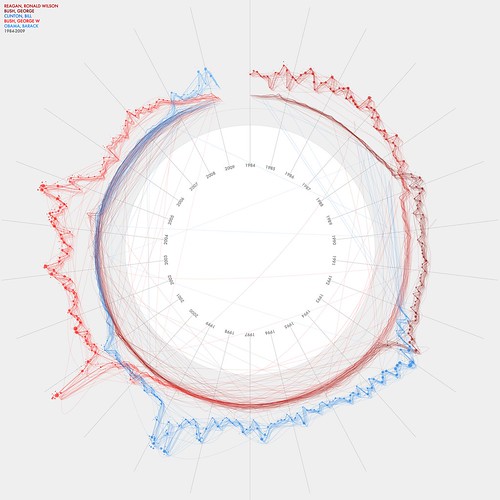
NY Times 365/360 by Jer Thorp
These visualizations show the top organizations and personalities for every year from 1985 to 2001. Connections between these people & organizations are indicated by lines.
Information Graphics


More Info Graphics examples. These are probably the best ones I've come across in my opinion. They all hold really rich information, interpreted in a really interesting and visually attractive way. But from getting up close to the designs I have tried to understand the info behind and some of them are not very easy to understand.
What is information Graphics?
'Visual metaphors are a powerful aid to human thinking. From Sanskrit through hieroglyphics to the modern alphabet, we have used ciphers, objects, and illustrations to share meaning with other people, thus enabling collective and collaborative thought. As our experience of the world has become more complex and nuanced, the demands to our thinking aids have increased proportionally. Diagrams, data graphics, and visual confections have become the language we resort to in this abstract and complex world. They help us understand, create, and completely experience reality.'
As more and more aspects of our lives become connected in the webbed environment of urban landscapes, the information that we generates and consume collects into massive databases. As Daniel and Joris from Catalogtree put it, 'By just going about our daily routines, we become part of a large and unseen ornament'. But this ornament is unformed and mutable, subject to the imagination and intent of the data designer. By giving shape to data, we not only provide access and insight to the hidden patterns of meaning it could reveal; we also give shape to the potential for creative collaboration between individuals. We live in a world where every idea has been thought of before, and it becomes too easy simply to use the Microsoft template for presenting our data. The visual form we adopt becomes driven by the tool or the topic we are presenting, rather than the usefulness of the data or the insight it gives us. 'This is business data, so it must be a bar chart' may be an easy way to approach the subject of presenting information, but it is a far less satisfying and provocative route for the designer of human thinking and intent.
The visual form we adopt becomes driven by the tool or the topic we are presenting.
Patterns of Intent - Design has been described as 'patterns with intent'. The information designers shapes an experience, or view, of the data with a particular aim in mind. To clarify, confuse, inspire, redress, and connect - all of these are legitimate intents for design, towards which the chosen visual presentation can be directed. A pinpoint in space spreads out to become a sphere of meaning. A structure space is manoeuvred to reveal connection, energy, hierarchy, and context. As multiple data points spread out to occupy coordinates in a matrix, we see a network of contextual values that derive sense from their relationship with each other. We travel through semiotic and scientific landscapes that communicate through colour, shape, patterns, and emotion.
The information designer shapes an experience, or view, of the data with a particular aim in mind.
-Data Flow
More Information Graphics


Like the way they have joined lines up to the appropriate information and again used big and small type. Also they have used one of the bits of information as a main article to catch peoples eyes. It may not be as noticable as say magazine articles but there is a clever grid made up from the information which gives it all a sort of order and balance. Very subtle but interesting work.
Layout, Grids, and Type


Came across some more information graphics and a few other things. Im really interested with dividers and grid sections, I'm not a particularly organized person but when it comes to visual communication and graphics there needs to be some order. I'm going to research it more but i've noticed there's a few tricks of the trade to section different bits of information, obviously its even more important in info graphics. Also these designs may have not been as aesthetically pleasing on screen but when printed onto this lovely paper its makes it really visually exciting.
Information Graphics


Information graphics has something that i've become increasingly interested in. I think it has a very miture quality to it and has a basis to it that is deeper than the aesthetics of it. I really enjoy the grids and big and small scales of type. Also appreciate where they have chosen to use lines to section different bits of information. You have to appreciate that usually information like this is produced in word or powerpoint and is incredibly hard to find interesting and in-gauge with.
Information graphics has a huge amount of applications for use, and obviously is a useful tool. Information graphics will also teach me to handle and structure large amounts of data which is useful to implement with just simple design task such as book layout and posters.
Subscribe to:
Posts (Atom)