
Showing posts with label Typography. Show all posts
Showing posts with label Typography. Show all posts
A Tomato Project - Process;
I when to the library to look for some more resources and inspiration for my Visual language project. Tomato is a studio I've recently been introduced to but have made a big impact on me. I've been looking at there book 'Process;) some very organic design. A lot of tomato's work is photography and typography based and quite abstract in places. These are some of the examples I picked from the book.


Interesting Publications


These are publications from university's when I went to 'new blood'. Was interesting to see how the different universities showed off there work. This is simple layout and typography but even the simple things get done wrong. I think its important that students get to design the university booklets because then you see what the standard of work is rather than the tutors standard of work. Much more worth while.
Letterpress Work


This was my first introduction to letterpress, I had seen the metal letters before, but never new the process that you have to go through to get ink on paper. The image at the top was a quote that I picked to use as content for the letterpress.
Letterpress is a really lovely technique but you can see why its being overthrown by the computer. But to be honest I want to use this technique as much as possible while its still around. But with the time it takes to set up your type correctly, fit it into the letterpress and make a successful print you could have done 200 prints on the computer. Time is money I guess.

Interesting Fonts


Something about these fonts stood out for me, can't say exactly but find them very inspiring. Very simple but very effective. I think I seem to over complicate my type, which is not that useful for a practicing graphic designer as generally we are trying to make it simple for people.
I use to think there was a massive database of fonts that people just downloaded and used, but looking at designers work and reading about there process of design, it's shown me that they make alot of there fonts themselves.
Amazing Typography


These are examples of really inspiring graphics and use of typography. They are all very modern, but still have the maturity of older more authentic fonts. These images are also taken from the book 'Type-One' which is really useful because it gives a little paragraph saying what the brief was and the solution they came up with. They also mention the idea behind the type, which I find interesting because they may be able to show me what steps to take in the future when making a typeface.
What stands out to me is the way that they refer to graphic design as a problem and that you have to come up with a solution. I've heard it being describe like this before but never really understood the comparison. Looking at briefs in the simple form, I suppose it makes sense. Need to do more briefs to have a better opinion on it.
In regards to the typefaces they all seem to have a really good flow to them, were as typefaces I'v made in the past have sometimes been to blocky and heavy, which makes people read it uncomfortably. Im going to make another typeface using the things I'v learn from these examples.
Typography Theory


These are really useful, simple to understand diagrams to see the important aspects of type, and the rules and guide lines in which to produce good typography. I new the basic rules of good type layout but always forgot what the different parts of letters were called, which is really important if you are going to take it seriously.
Also in these diagrams they highlight the sections they talk about which again makes the whole thing really easy to understand.
Books used : Type-One - Discipline and progress in typography.
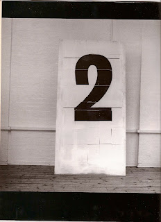
Photos of Type


As my interest in typography grows I can't seem to see anything other than type, which is why I took this picture. I had seen these boards before and wished I had my camera with me. So finally got my picture. The dark shadow in it kinda annoys me but I'm no photographer so can't expect to much. There are ten boards which I took individual photos of so that I could blend them into a panoramic shot (I think thats what its called). There's nothing really that special about the type itself but I just like the fact, that its locational and raw.
Layout, Grids, and Type


Came across some more information graphics and a few other things. Im really interested with dividers and grid sections, I'm not a particularly organized person but when it comes to visual communication and graphics there needs to be some order. I'm going to research it more but i've noticed there's a few tricks of the trade to section different bits of information, obviously its even more important in info graphics. Also these designs may have not been as aesthetically pleasing on screen but when printed onto this lovely paper its makes it really visually exciting.
Block Type

This is a type I have come across alot recently, used by the likes of 'Build' and 'Non-Format. Based on square, then taking off the very minimum from the square to represent the letter. The layout always looks very clean cut and edgy because the type is so user friendly and grid orientated. It stands out dramatically with the background being so dark and the type being so bold.
Type Treatments (Non Format


Always interested in different type faces and different techniques in making modern and eye catching typography. Most of these examples are from the design studio Non-Format. I really like the difference between big and small type, I think this is half the battle to get two fonts one in a large type size and one as a smaller body type. Non Format achieve this very well. I also like the layout and the different grids used, I enjoy chaos in some design but I also think its good to have a certain amount of rules that you abide by in design.
Off cuts from Team-Impression


As we were walking around the Team-Impressions building I saw a few pieces of work that I liked so we were able to take them away. One of the piece of work was printed onto some really nice paper which I can use as a example when I go to print something. The guy at Team was saying how they did this experimental process to this design and that it was something they were able to do, apparently the client didn't go for it in the end but its always good to try new things.
Printroom Work


Demonstrations of techniques available including: CMYK separations, Halftone separations, Textile printing - e.g. T-shirts, other techniques such as flocking and foiling (relevant for Collectors Brief)
I really enjoyed the foiling in the printroom as I think this looks the most proffessional and best finish. I also think that this is the one that will most apply to my work. Going to look at foiling my illustrations and then in the future foil book titles and cover pages which is what its mostly use on. But as you can see it has a certain style and look on material.
'Build' - Designing for D&AD 2007

8x A5 postcard set [+ A3 folded poster] enclosed in a custom foil blocked slip case. Forms part of the print communication of the D&AD 'Global Nominations Awards exhibition 2007'. Under the title 'Ideas are Fragile'
Hopefully one day I can produce something for D&AD.
Subscribe to:
Posts (Atom)